“Bands of Color #32″ – Mixed Media Collage on Mat Board – 7″ x 5″ – Matted & Framed to 14″ x 11” – Black Wooden Frame
With less than a week left in my Studio Sale & Fundraiser for Gather, there are lots of lovely paintings still on the wall, including some of my favorites. To give you a closer look before you come in to buy, I’m highlighting a few of the individual paintings.
This is one of a series of small collages that remind me of the landscape. They are more evocative than representational. I think that’s part of the charm. If this appeals to you, come on in and check it out.
During this Studio Sale, I’m donating a portion of each sale to Gather to fight hunger in the Seacoast. If you’re not familiar with Gather, check out their website. They are doing amazing work. Lane House Arts Center is collecting food and cash donations for them through December 20th.
“Bands of Color #35″ – Mixed Media Collage on Mat Board – 7″ x 5″ Matted & Framed to approx 15″ x 12” – Black Wood Frame
I’m so excited by the response to my Studio Sale & Fundraiser for Gather. Two more paintings found their forever homes just yesterday. A big thank you to all of the collectors who have already come in and selected paintings either for their own homes or as gifts. I love that some of my favorites have already found new “forever” homes.
But… With less than a week left in my Studio Sale & Fundraiser for Gather, there are still lots of lovely paintings still on the wall, including some of my favorites. To give you a closer look before you come in to buy, I’m highlighting a few of the individual paintings.
This is another old favorite that has often been in my studio because I really like it. I love the different colors and textures in this small painting. It’s another piece just makes me feel good. But, it is time to let it go to a fabulous new “forever” home.
During this Studio Sale, I’m donating a portion of each sale to Gather to fight hunger in the Seacoast. If you’re not familiar with Gather, check out their website. They are doing amazing work. Lane House Arts Center is collecting food and cash donations for them through December 20th.
Ethel Hills – “Rhapsody” – Mixed Media Collage on Panel – 20″ x 20″
With about a week and a half left in my Studio Sale & Fundraiser for Gather, there are lots of lovely paintings still on the wall. To give you a closer look before you come in to buy, I’m highlighting a few of the individual paintings.
This is an old favorite. The warm colors make me think of a sunrise and the horizontals make me think of the salt marsh. It has an overall feeling of hope and joy, which is inspirational for me. It makes me feel good every time I look at it. I hope it will bring a smile to someone else’s face.
It’s been on my studio wall almost since I moved into my space at Lane House Arts Center. Although I love being inspired by it everyday, I would really love for it to find it’s “forever home”.
During this Studio Sale, I’m donating a portion of each sale to Gather to fight hunger in the Seacoast. If you’re not familiar with Gather, check out their website. They are doing amazing work. Lane House Arts Center is collecting food and cash donations for them through December 20th.
Ethel Hills – “Color Block #11 (8 inch panel) – Mixed Media Collage on Panel – 8″ x 8”
I have less than two weeks left before the end of my Studio Sale & Fundraiser for Gather and still have lots of lovely paintings still on the wall. To give you a closer look, I’m highlighting some of the individual paintings.
This is one of my Color Block paintings, constructed of watercolor collage on wooden panels.
Color Block #11 (8 inch panel) is mixed media collage on 8″ x 8″ wooden panel with a black metal frame – framed size is approximately 9″ x 9″. This is another old favorite. I love the color combination on this piece. A perfect little gem to brighten up a small spot.
During this Studio Sale, I’m donating a portion of each sale to Gather to fight hunger in the Seacoast. If you’re not familiar with Gather, check out their website. They are doing amazing work. Lane House Arts Center is collecting food and cash donations for them through December 20th.
We’re now at day three of my experiment about whether knowing more about a piece of art is helpful or detrimental. Now I get to share all the stuff I was thinking about when I started this series of blog posts.
This painting is part of a series of abstract landscape paintings, lovingly called “The Land Project”. It is one of my favorite pieces in this series and I titled it accordingly. “Simple Gifts” is the title of a Shaker hymn that was written at the Alfred Shaker Village in the mid 1800s.
If you don’t know it, here’s an old Judy Collins recording of the first verse. I think the melody will be familiar. You may also know this music from Aaron Copeland’s Appalachian Spring.
Anyway, getting back to the point. Not only is this lovely music, with a powerful message, but it has personal meaning to me as well. For 25 years, I ran a rug hooking retreat at the Notre Dame Spiritual Center in Alfred, Maine. This is the same property that the Shakers occupied up until the early 1930s when the Brothers of Christian Education purchased the land and buildings. The land and the space feel sacred. There’s a peacefulness and quietness to the area. Although the painting isn’t directly about this particular piece of land, I hope it conveys some of the feelings embodied in the words of the hymn.
Here’s a copy of the lyrics. This was given to me several years ago by one of the brothers. He would sometimes sing this for us at dinner.
‘Tis the Gift to Be Simple
1. ‘Tis the gift to be simpIe, ’tis the gift to be free, ‘Tis the gift to come down where you ought to be, And when we find ourselves in the place just right ‘Twill be in the valley of love and delight.
2. ‘Tis the gift to be gentIe, ’tis the gift to be fair, ‘Tis the gift to wake and breathe the morning air; And ev’ry day to walk in the path we choose, ‘Tis the gift that we pray we may ne’er come to lose.
3. ‘Tis the gift to be loving, ‘ tis the gift best of all, Like a quiet rain, it blesses where it falls; And if we have the gift, we will truly believe ‘Tis better to give than it is to receive.
Chorus. When true simplicity is gained, To bow and to bend we shan’t be ashamed; To turn, turn will be our delight, Till by turning, turning we come ’round right.
So here’s the question: Is this further information helpful or not? I often wonder how much to share about a piece of art, so I’m interested in your thoughts.
Ethel Hills – “Simple Gifts” – Mixed Media Collage – 22″ x 30″, Framed Size – 28″ X 36″
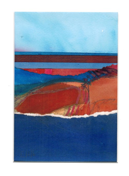
Ethel Hills – Bands of Color – Mixed Media Collage on Paper – 7″ x 5″
I posted this image earlier this
week to give you an idea of what I’d be teaching at my upcoming workshop. Not
all pieces will be this complicated or this colorful, but I wanted to give you
at least a bit of an idea.
I started this piece earlier this
month with just a hint of an idea. The idea came from an old figure painting
that I wanted to reuse.
I loved the blues and oranges in the
original, so I tore off a fairly quiet piece for the background/sky and a much
busier colorful piece as the “major player” in the painting.
One thing about this piece that makes it a bit different is the use of thinner, lighter weight papers. In the past, I’ve primarily used watercolor paper for the collage elements. Unfortunately, gluing heavy papers like this is time consuming.
For my workshop, I knew that I was going to need to use some lighter weight papers that we could glue and then keep going. For this reason, I have all kinds of alternative papers in my studio. I’ve taken to painting on sketchbook paper, oriental papers, drawing papers, etc.
Turns out that using the lighter
papers really helped me out on this one.
I usually try to have a pretty good
idea of where I’m going before I start gluing. It doesn’t always work, but it
makes it easier if I’m not making major design changes in the middle of the
gluing process.
At one point, I decided that I
really needed to start on this painting, so I went ahead and glued the first
couple of pieces. I still wasn’t sure of the rest, but I knew that the blue
that became the horizon line was right – the right color and value, and also
the right location. The next piece was the dark red just below it. That was a
much larger piece of paper. It’s the dark red just below the horizon line, but
also the darker blue at the bottom of the painting.
Now, I just needed to figure out the
placement of the rest of the elements. I was pretty sure there would be quieter
blue and orange bands to contrast the more complicated blue and orange piece
from the figure painting. I still needed to sort out the order, the size, etc.
A lot of it is a question of relationship – how this piece relates to that
piece – color, value, size, space between elements, etc.
After gluing down one of these
pieces, I realized that the spacing just didn’t “feel right”, so I adjusted it
by gluing on an extra piece. This was much easier because these collage pieces
were watercolor painted on a lightweight drawing paper. It was a simple fix and
basically invisible to the viewer.
I finally decided on the final touch. I added two small verticals in the orange band. They’re hardly noticeable because I kept the values very close, but the painting feels so much better with them than without them.
When I finally finished it, I was so
excited. The painting has depth that I just wasn’t seeing until it was
complete. The whole really is greater than the sum of the parts.
If you’d like to see the original, the painting is up at the Barn Gallery in Ogunquit, Maine until we close on Columbus Day or until it sells, whichever comes first.
Ethel Hills – Ocean & Sky #3 – Mixed Media Collage on Panel – 12″ x 12″
My mission is to help others appreciate, acknowledge and embrace the love and joy and wonder in their lives in the moment.
This morning, I did a quick walk down to the beach to get a bit of exercise, some fresh air and a good start to the day. The first person I spoke to was a young gentleman new to the area. I’m not sure if he’d never seen the ocean before or if he’d just never seen this one. He was in awe and had a smile that went from here to there and back again.
I also saw a young couple further down the beach. They were talking and then embracing.
I was only on the beach for a few minutes, but that was a lovely start to my day. It reminded me of similar joyful moments in my own life.
It also made me wonder if my mission is needed. These people certainly didn’t seem to need help with this.
I was recently talking to another artist about the bright cheery colors of my paintings and I realized something that I have never said before. “My paintings are always positive.” I’m not sure that I had ever thought of it before. Once I said it though, it felt true. I tend to use very bright cheery colors.
Ethel Hills – Arrangement in Blue & Orange I – Mixed Media Collage on Paper – 6 3/4″ x 6 3/4″ – Framed to 12″ x 12″ – SOLD
As I learn more about myself as an artist, I know that my art is instinctively about love and joy and wonder. For me, that all ties into the landscape. I love where I live and spent my life with my husband. I love the marsh and the birds that live there. I love walking the beach. I also love where I grew up, on land that had been in my family for generations. So I not only love these spaces, but I Iove and revere the family connections and love these spaces remind me of.
Although most of my paintings are abstract and don’t represent specific land, I think that they’re always about those things which are important to me – love, family, wonder, joy, peace and tranquility.
I have two exhibits coming up in September. Kind of odd, since I haven’t been doing much exhibiting the last couple of years. But that’s another story……
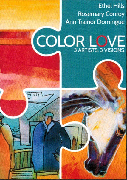
I’m really excited about both of these opportunities. The first one is at The Gallery at WREN (Women’s Rural Entrepreneurial Network) in Bethlehem, NH. I’m exhibiting with two other NH artist friends, Rosemary Conroy and Ann Trainor Dominque. Although I’ve known both Rosemary and Ann a long time, this is our first group exhibit. “Color Love – 3 Artists, 3 Visions” will run from September 7th through October 1st. Our artists’ reception is Friday, September 7th from 5 to 7pm.
And let me tell you, it’s all about the color! There will be a roomful of vibrant color for you to check out. And in quite a range of sizes. I can pretty much guarantee that my pieces are the smallest, most of them ranging from 4 inches square to 8 inches square, the perfect size to tuck a bit of color and inspiration into a corner, a bookcase, or a nightstand. Ann and Rosemary will both have larger pieces, strong enough to hold the focus of your room. I think this is going to be an incredible exhibit with lots to offer both buyers and viewers.
Come on the evening of the 7th to meet the artists or come later in the show when it might be a bit quieter.
And – YES!! I did get in. And I think I was really lucky. There was a lot more work submitted for this show than there was room. So there were some pretty wonderful pieces that did not make the cut.
So thank you to the universe and all my readers who had their fingers crossed for me.
The reception is Saturday, February 13th from 7 to 9pm. Unfortunately, I won’t be able to go as I have another commitment that evening. I’ll have to pop in another day to check it out once it’s all properly hung.
Regular updates on where you can view my art in person
A sneak peek at what’s going on in my studio
Please check out my website –
For a more complete view of my current art, please refer to my website - www.ethelhills.com.
This space will continue to deal with what's going on in my art life in a little bit more detail.